Made AI the copilot of Flamey's core workflow: from intent to launched sequence in minutes, not forms.
A four-day product-design challenge for Foundey: audit, user flow, lo-fi, and hi-fi for an AI outreach tool.
- Product Designer · 2024
- Product Design
- AI UX
- Design Challenge
- 4
- Days, brief to hi-fi prototypes
- 3
- Personas grounding every decision
- 5
- Root causes surfaced by the audit
- 8
- Screens, lo-fi through hi-fi
The problem
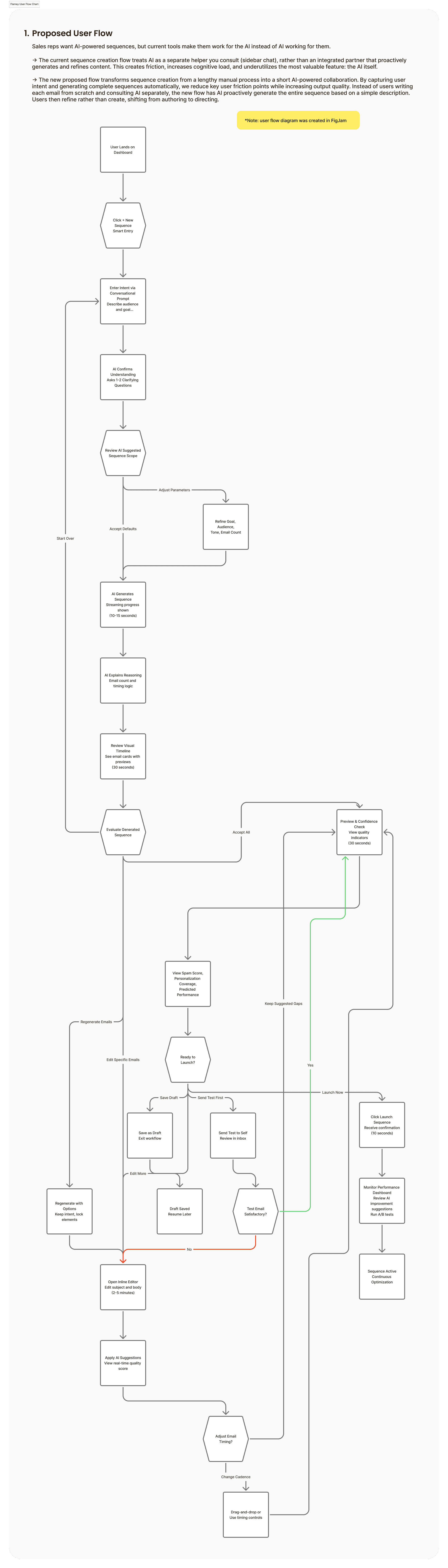
Sales reps want AI-powered sequences, but current tools make them work for the AI instead of the AI working for them. Flamey's sequence creation flow treated AI as a separate helper you consult, a sidebar chat, rather than an integrated partner that proactively generates and refines content. That created friction, increased cognitive load, and underutilised the product's most valuable feature: the AI itself.
The core tension: AI exists, but it is not in the workflow. Users do manual translation instead of direction.
“How might we integrate Flamey's AI directly into sequence creation so it becomes a copilot that generates and optimises sequences, instead of just offering advice?”
Personas
Three personas grounded the work. Sarah, a time-pressed SDR who wants AI to do the heavy lifting but needs it to still sound like her. Marcus, a founder with no sales background who needs the tool to just work. Jessica, an account executive whose prospects can tell when outreach is robotic; she wants control over every word.


Root causes and audit
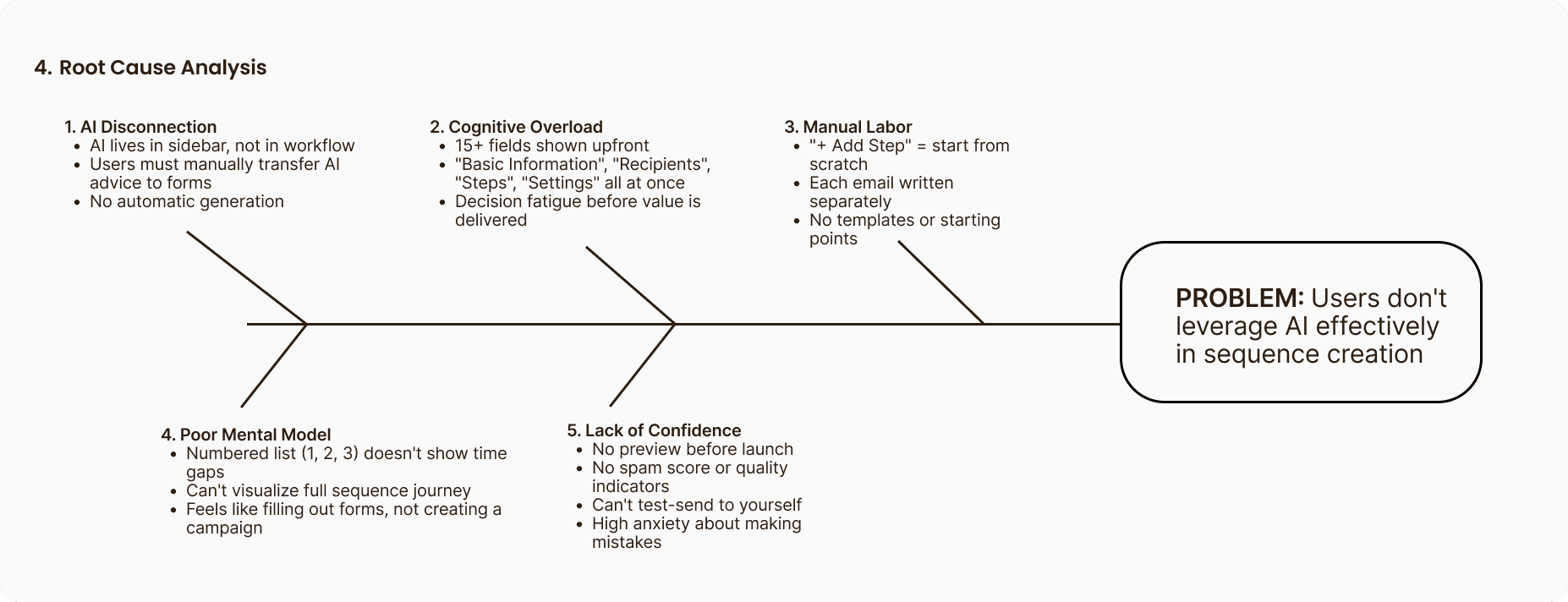
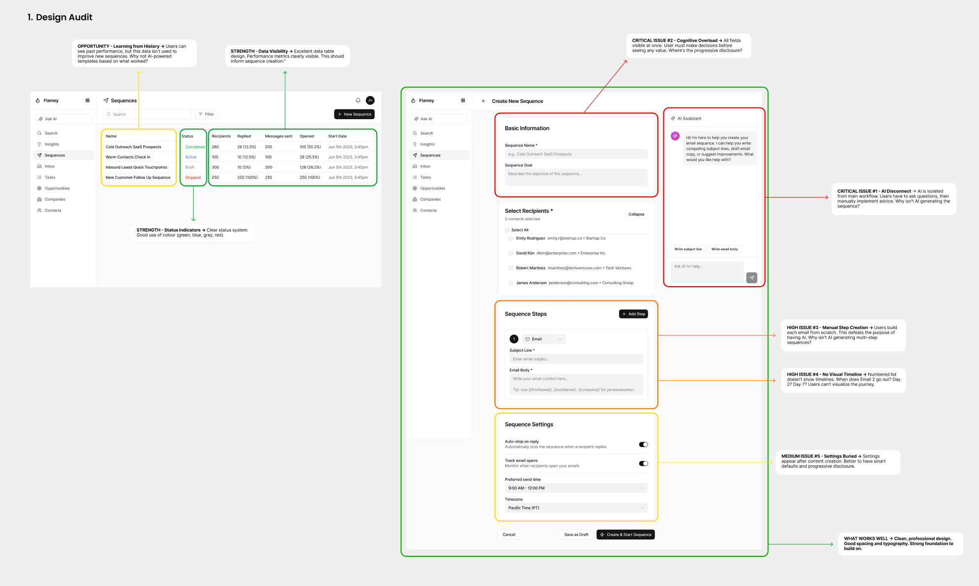
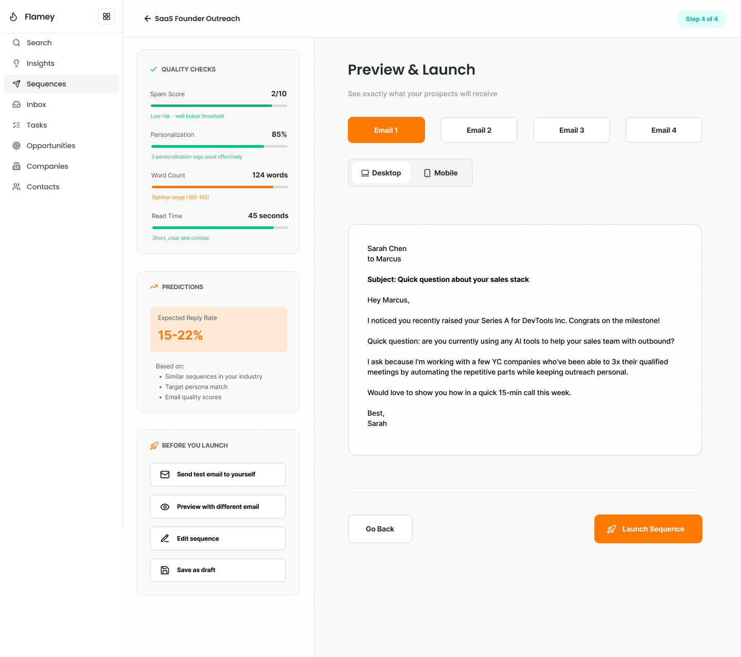
A screen-by-screen audit revealed five core issues driving friction: AI disconnection, cognitive overload, manual labour, a poor mental model, and a lack of confidence at launch. The strongest finding: preview and confidence scored one out of five (no preview, no mobile view, no spam score, no test send), which meant high anxiety and heavy post-launch editing.
Competitive landscape and journey gaps
Benchmarking Apollo, Attio, and 11x showed Flamey already had AI that Apollo and Attio lack, but didn't integrate it as well as 11x, and 11x is too complex. The opportunity: combine 11x's AI power with Attio's simplicity.
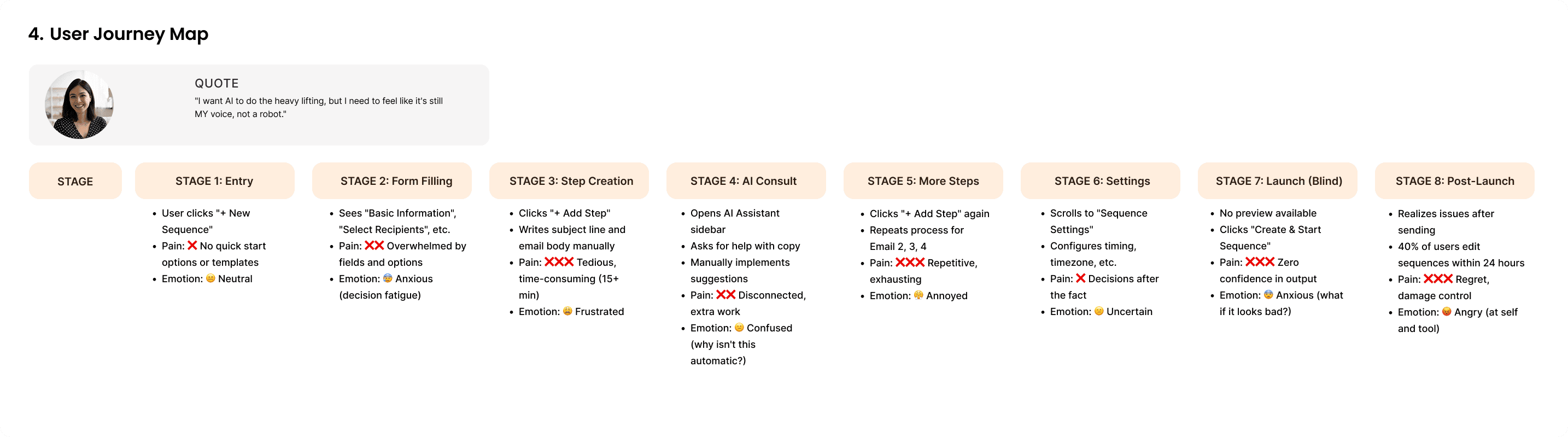
The journey map surfaced four structural gaps, each with a fix: integrate AI as an embedded copilot, auto-generate multi-step sequences from a brief, replace the numbered list with a day-based timeline, and cut cognitive load with progressive disclosure, starting with three questions.
- 70–80%
- Projected cut in sequence-creation time
- 85%+
- Target first-sequence completion, up from ~40%
- 70%+
- Target AI content acceptance, up from under 20%
(Metrics are illustrative for the exercise, sized from the audit, not measured in production.)
The proposed flow
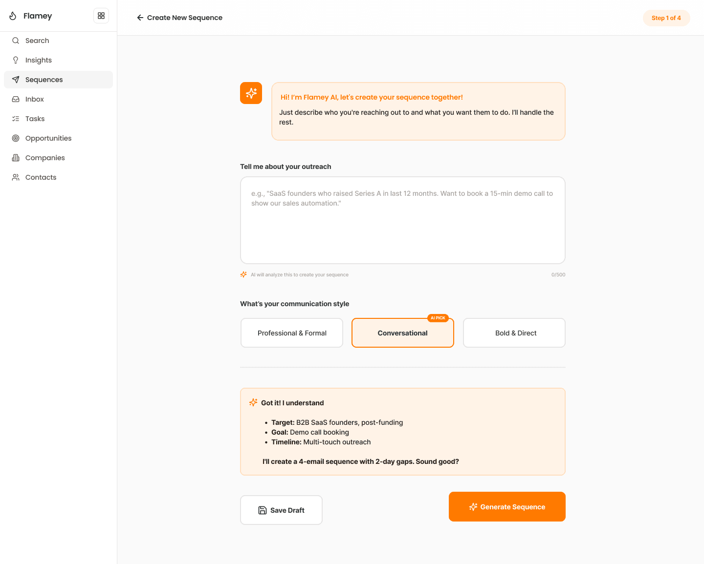
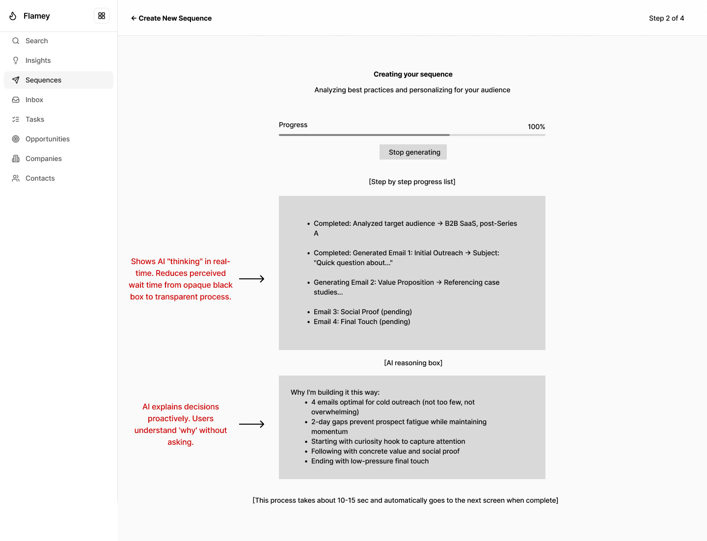
Before: a form-heavy flow, AI in a sidebar, manual step creation, no preview. After: intent capture first, AI generates the sequence draft, a timeline editor shows day spacing, and preview plus quality checks come before launch.
Before
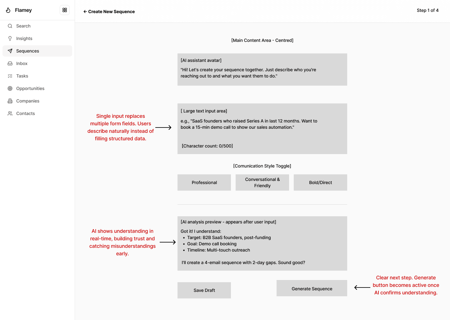
After
Before
After
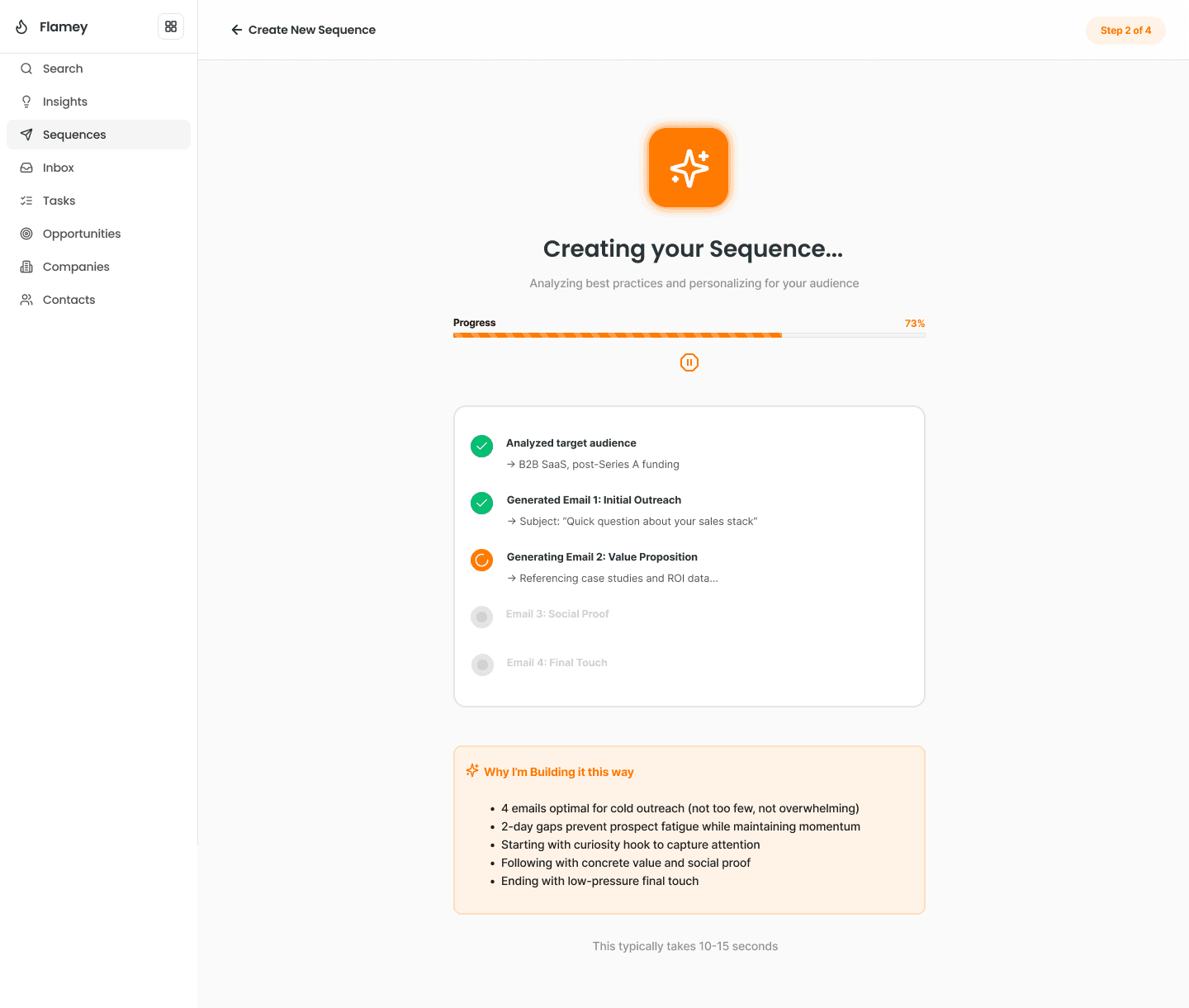
Before
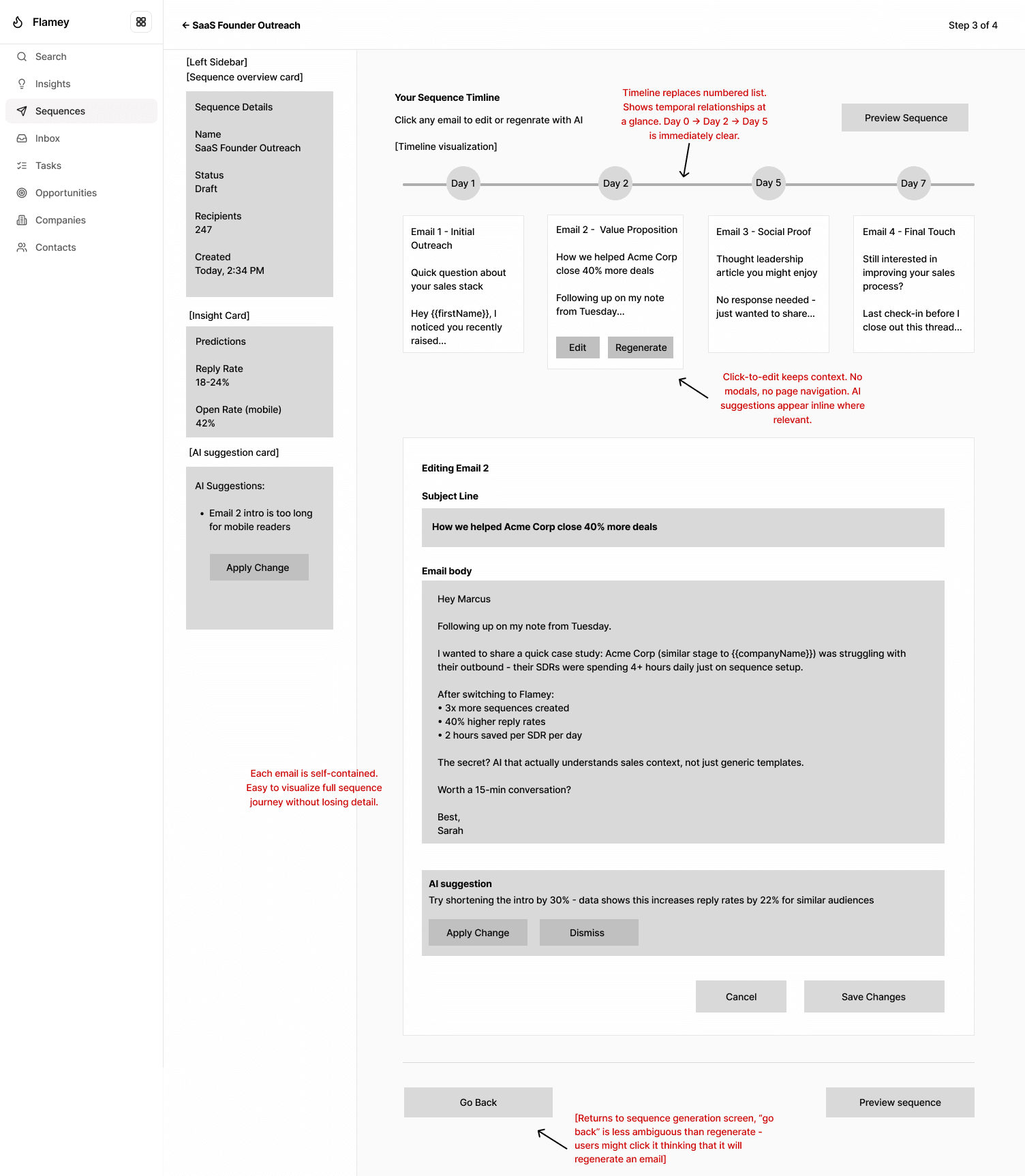
After
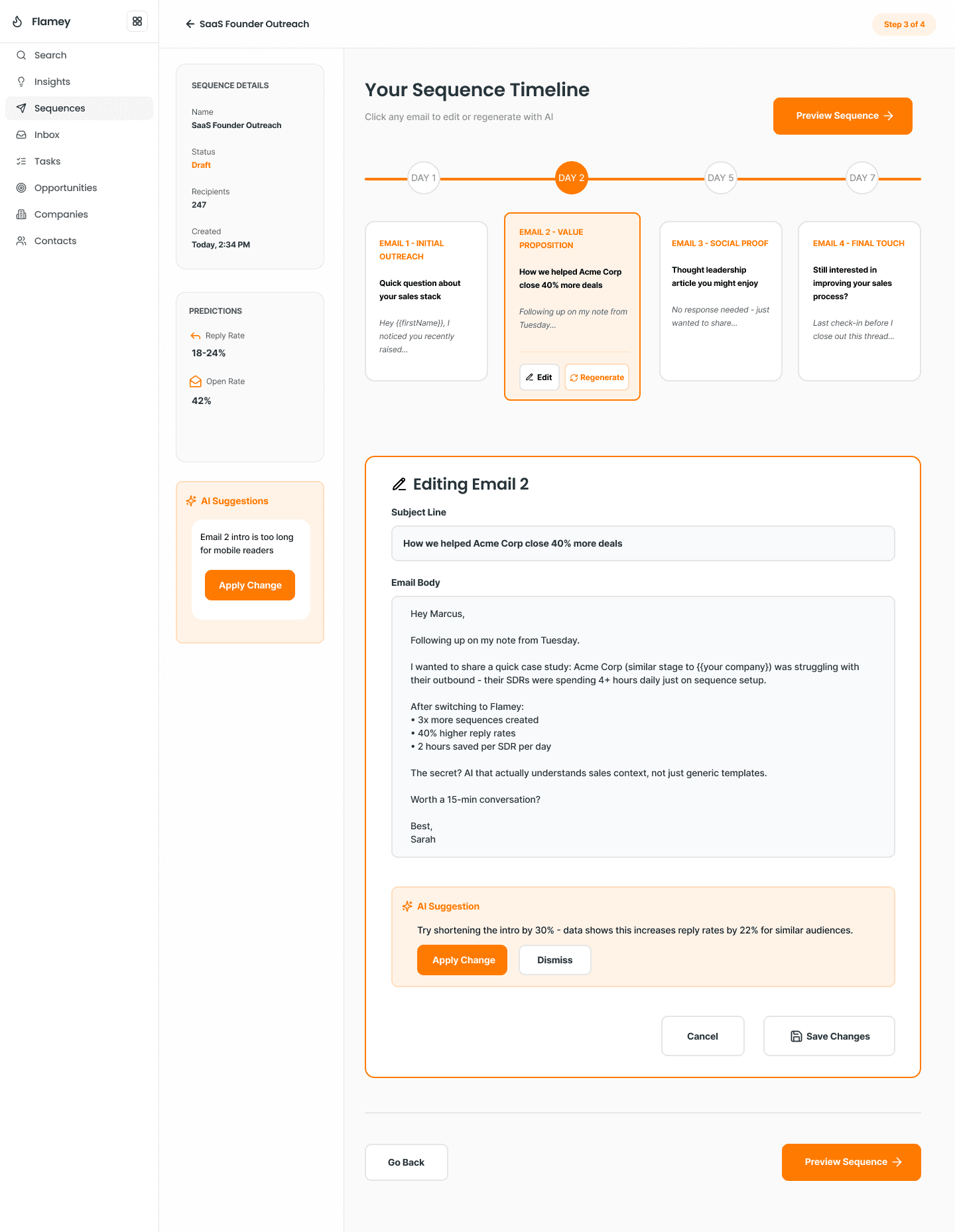
Before
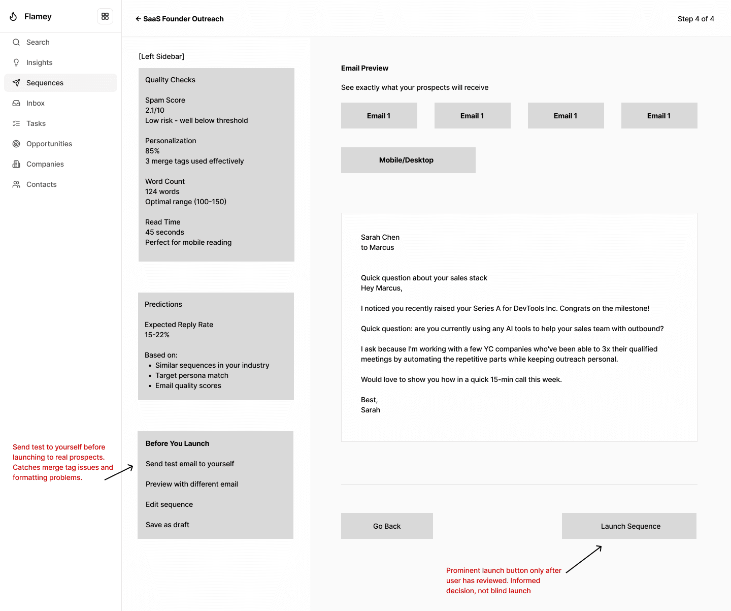
After
Design decisions
The UI stays light and text-first because sequence creation is content-heavy. Orange is used sparingly so it stays meaningful and signals AI-assist moments. Spacing follows Chakra conventions so the designs feel consistent and buildable. The overall goal: fast and guided, without removing user control.
Next steps: usability-test with SDRs for time-to-first-sequence, measure completion and AI acceptance rates, then iterate on tone controls and template suggestions.