Data design · Institutional
OCAD University Student Analytics Dashboard
Replacing 119+ fragmented legacy reports with a centralized analytics platform giving leadership real-time visibility into enrolment, demographics, and funding.
Role
UX Researcher, Dashboard Designer
Timeline
Sept 2023 – June 2025
Tools
Power BI, SQL, DAX, Microsoft Fabric
Client
OCAD University
Outcome
119+
Reports replaced
Fragmented legacy reports across SAP and Slate consolidated into four dashboards.
4
Dashboards shipped
Three operational dashboards plus one executive view spanning historical data to the 1940s.
15+
Stakeholder interviews
Contextual inquiries with admin staff across departments before a single screen was designed.
Adopted immediately by the Vice Provost and CTO, used regularly by leadership and planning teams, and recognized by the university president at launch. The first time OCAD had a centralized analytics platform in its history.
Problem
Administrative staff were making decisions off a patchwork of static reports with no single source of truth.
119 individual reports existed across SAP and Slate with no consistent format, no cross-system integration, and refresh cycles too slow to support timely decisions. Teams duplicated effort and spent time managing report logistics instead of acting on insight. Before any interface decisions could be made, the work was a data problem: the insights staff needed did not exist in any one place. I built SQL queries to join datasets across systems using shared keys — for example, calculating average enrolment by combining retention and completion reports that had never been connected before.
Early direction
A single enrolment prototype
After 15 or more interviews and contextual inquiries with admin staff, I started narrow: a comprehensive view focused entirely on enrolment. It surfaced student population, major, year, transfer status, average enrolment, and average FTE (credit load), with filters for year and term. Nothing had been aggregated this way before. When I presented it to the Vice Provost and CTO, their reaction was immediate. They said they had never been able to pull a high level enrolment overview that quickly and started using it on the spot. That reaction confirmed the appetite was real and raised the bar for the next version.
Feedback moment 1
Expanding the scope revealed a structural problem
Encouraged by that reception, I extended the same approach to demographic and financial data — adding country of origin, immigration status, gender, sexual orientation, funding type, and location. I brought it back as one expanded dashboard combining enrolment, demographics, and financial aid in a single view. The feedback was honest: the data was valuable and staff wanted all of it, but the dashboard had become overwhelming. Too much in one place made it harder to act on any of it. The problem was not the data. It was the structure.
What changed
I stopped thinking about this as one product and started thinking about it as a suite.
Feedback moment 2
Two use cases, four dashboards
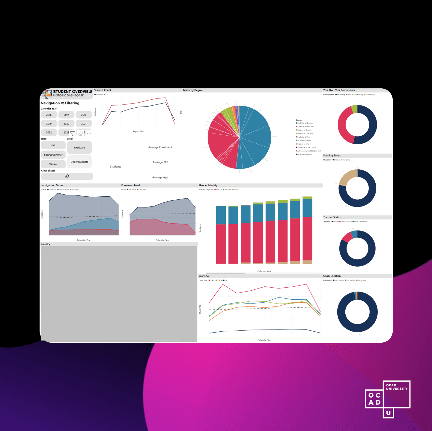
I redesigned around two distinct use cases that had emerged from how staff were actually engaging with the data. The first was operational: departmental staff who needed to work quickly, pull snapshots, and act on current year data. For them I built three focused dashboards covering enrolment, demographics, and funding, each scoped to the current academic year. The second was strategic: senior leadership who needed longitudinal context. For them I built a fourth dashboard spanning historical data going back to the 1940s when the university's records were digitized in the 1970s.
What changed
Four dashboards instead of one, with architecture driven entirely by who was looking and what decision they needed to make.
Final design
Four Power BI dashboards deployed across departments through Microsoft Fabric, built on composite SQL models joining data from SAP, Slate, and legacy systems. Three operational dashboards scoped to the current academic year for enrolment, demographics, and funding — designed for speed and daily use. One executive dashboard with full historical data spanning decades for institutional planning. AODA compliant layouts, responsive filtering, and a consistent visual language across all four.
Reflection
The biggest lesson was not about dashboards. It was about data architecture as a design problem. Before any interface work began, the task was understanding what data existed, where it lived, and how to connect it. The SQL layer was load bearing. Without it, there was nothing to show. Institutional design also moves differently than product design. Every decision touches governance, privacy, and departmental politics. That friction is slow, but it pressure tests choices in ways that matter. What I would push next: predictive analytics for enrolment and retention trends, and self serve customization so teams can adjust their own views without requesting a rebuild.